

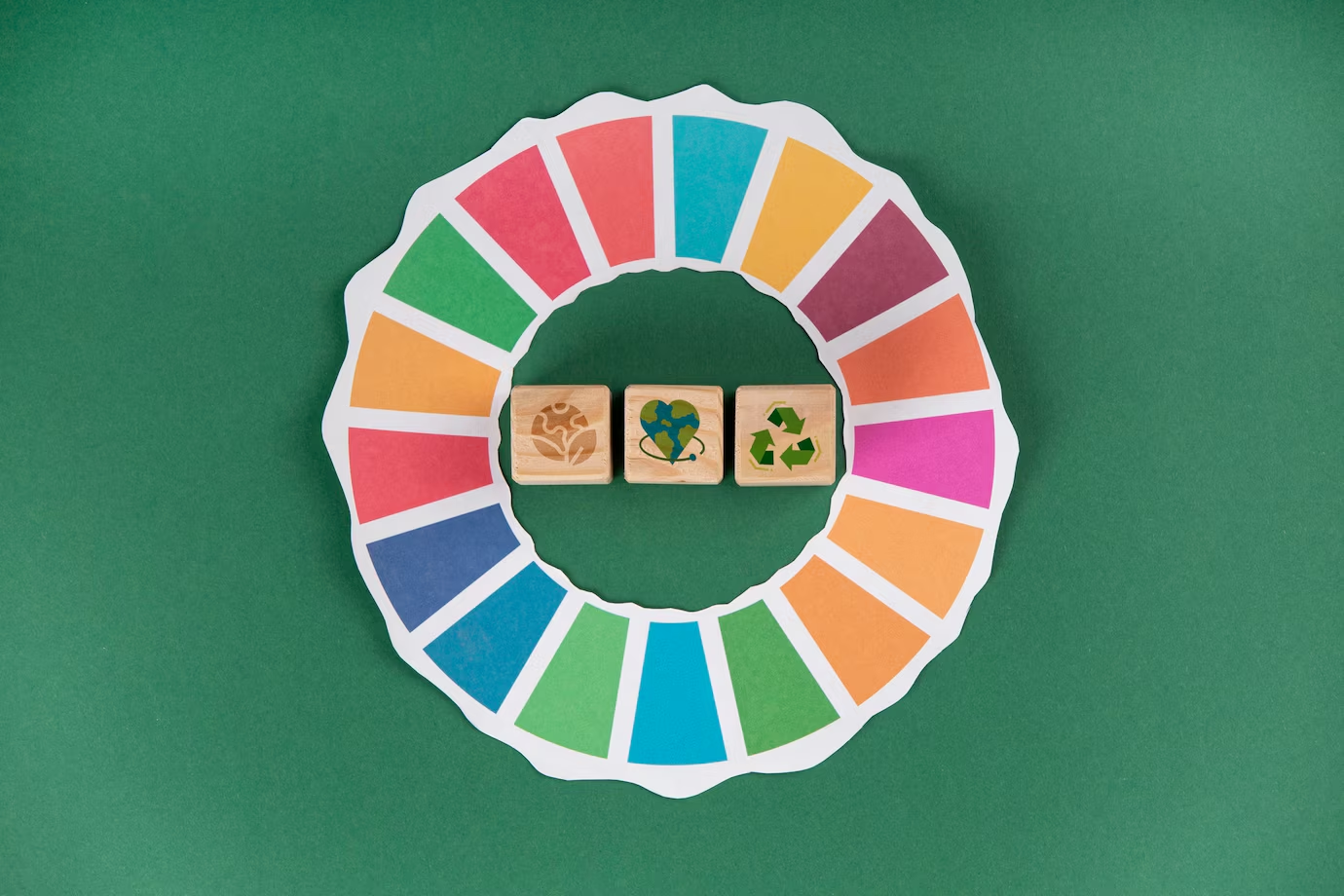
Choosing colors for a space isn’t just about aesthetics. Color theory—the science behind how we perceive colors and their effects—plays a crucial role in how we feel and interact with our environment. Whether it’s to boost creativity, enhance comfort, or improve focus, understanding color is a powerful tool for transforming any space.
According to interior designer Laura Mendes, “Colors have the power to influence emotions and even cognitive functions. Warm tones can make a space feel cozier, while cool tones help create a relaxing atmosphere.” This impact is rooted in how the human brain interprets colors and the emotional associations they carry.
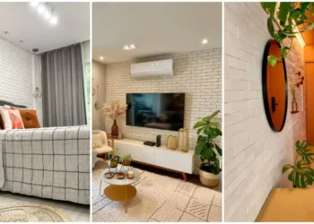
Color Theory and the Perception of Space
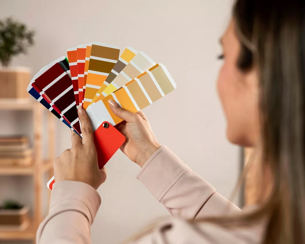
Colors are never seen in isolation. Their appearance and effect depend on lighting, the materials they’re applied to, and how they interact with other shades. “Natural light brings out colors in their truest form, while artificial lighting can significantly alter them. That’s why testing a color in different lighting conditions before painting a wall is essential,” advises architect Gustavo Ribeiro.
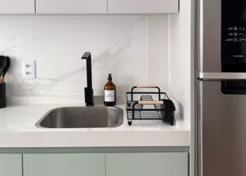
Color selection should also consider the relationship between different elements in a room. Lighter shades help visually expand small spaces, while darker tones create a more sophisticated and cozy atmosphere. Vibrant colors can be used strategically to highlight details or inject energy into a space.
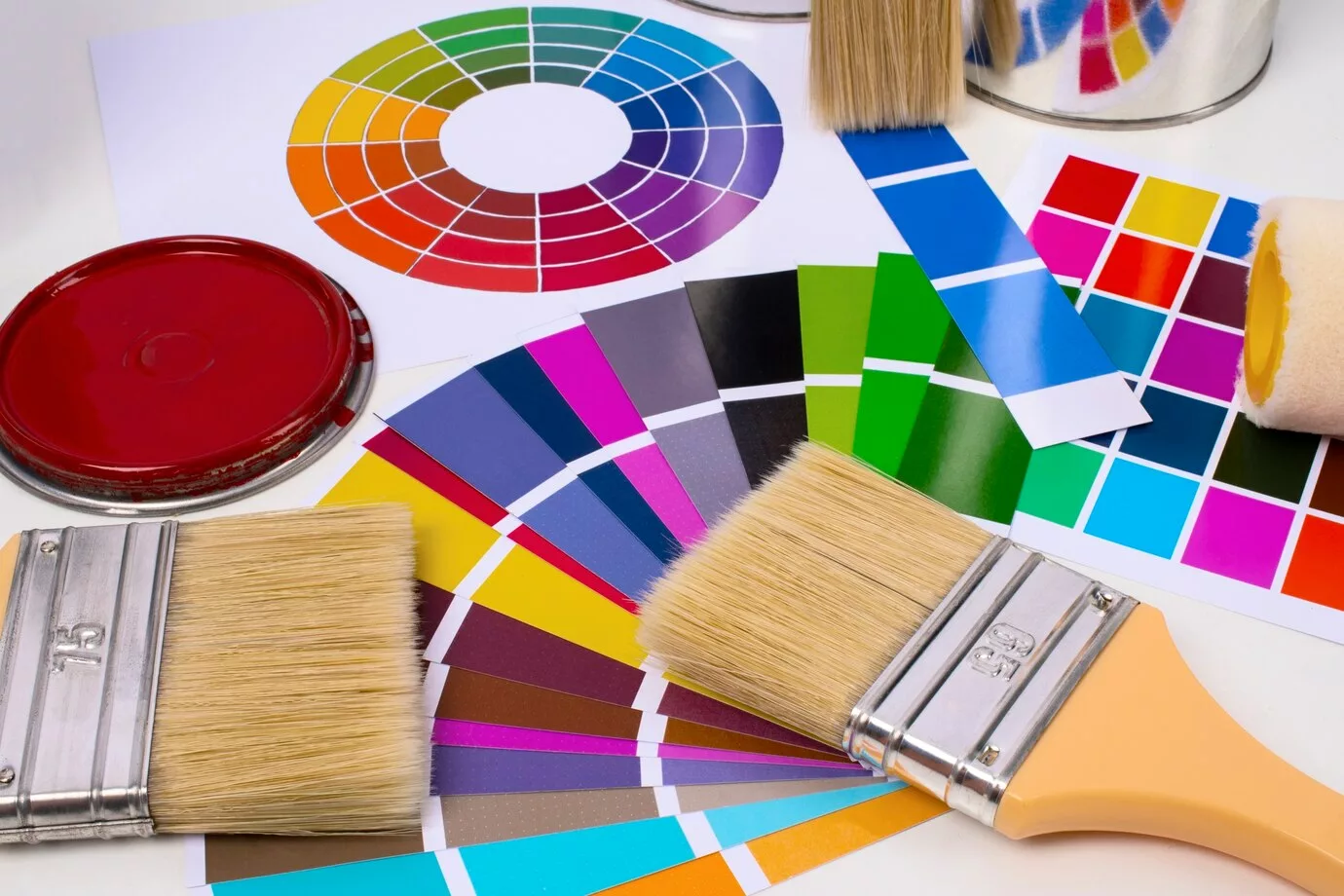
The Color Wheel and Harmonious Combinations
The color wheel is an essential tool for creating a well-balanced interior design. It helps define the relationships between colors and how to combine them effectively. Some common color schemes include:
- Monochromatic: Variations of a single color, creating a sophisticated, minimalist look.
- Analogous: Colors that sit next to each other on the color wheel, forming a smooth and harmonious palette.
- Complementary: Opposing colors on the color wheel, providing strong contrast and dynamic appeal.
- Triadic: Three colors evenly spaced on the wheel, creating a vibrant yet balanced visual effect.
Understanding these combinations allows you to design spaces that evoke different moods. Earthy and pastel tones, for example, promote warmth and comfort, while cool colors like blue and green encourage relaxation and focus.
The Impact of Color on Well-Being and Productivity
Color psychology has been extensively studied, revealing how different shades influence behavior and emotions. Yellow, for instance, stimulates creativity and communication, while red is energizing and can intensify emotions. In workspaces, color choice directly impacts productivity.
Modern offices often use a mix of neutral tones with vibrant accent colors in elements like chairs, pillows, or artwork. This approach keeps the space dynamic without causing visual fatigue. In bedrooms, soft and natural hues promote relaxation and better sleep. “Avoiding overly vibrant colors in bedrooms is crucial for quality rest. Opting for shades like light blue, olive green, or beige is a smart choice,” advises Laura Mendes.
Applying Color Theory to Your Home Decor
For those looking to transform their home with color theory, there are a few key principles to keep in mind. First, always test paint samples before finalizing a palette, as colors can look different depending on lighting and surface texture. Another effective strategy is balancing bold hues with neutral tones to maintain a cozy and harmonious feel.
Finishes also play a role in the final look of a color. Glossy surfaces reflect more light and can intensify a color’s brightness, while matte finishes provide a softer, more uniform effect.
By understanding the science behind color, you can create spaces that not only look beautiful but also enhance your mood and well-being.